About Us
Tapex is always with you.
Corporate Identity
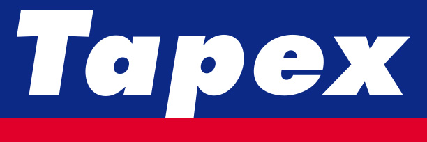
Tapex is a compound word of tape and apex (top) which means the top of tapes
CI expresses the innovation, honesty and the commitment of to the future of Tapex.
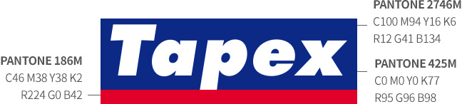
The blue color in upper part of CI represents the innovative mind of the business through the blue space. It also contains the quality promise with our clients via the blue reliability. The red color in lower part emphasizes dynamic image and modern sense. The white color stands for cleanliness of product process and express the exclusive honesty of Tapex. Tilted typography shows the commitment of business advancing to the world.
Features of Logo
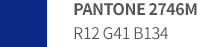
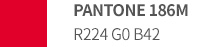
Color
In principle, the designated color is allowed to use.

Instructions
You should be case-sensitive when using the name of ‘Tapex’.
You cannot arbitrarily change the logo type as it was designed in consideration of harmonization.
하단영역
© Tapex. All Rights Reserved.
-
head office
#812, Ace Gwanggyo Tower, 17 Daehak 4-ro, Yeongtong-gu, Suwon-si, Gyeonggi-do
-
Yanggam Factory
62-16, Chok-ro 532beon-gil, Yanggam-myeon, Hwaseong-si, Gyeonggi-do
-
Paltan Factory
39, Gojudongbang-gil, Paltan-myeon, Hwaseong-si, Gyeonggi-do
-
Hyangnam Factory
108, Mannyeon-ro, Hyangnam-eup, Hwaseong-si, Gyeonggi-do
-
Contact number031-8047-4100
-
E-mailtapex@tapex.co.kr